Ask any chatbot to brainstorm uses for an umbrella and you get rain, shade, and parasols. Ask it again with more emphatic prompting and you get rain, shade, and parasols phrased three new ways. The model is not being lazy. It is doing exactly what it was trained to do, which is return the statistically nearest tokens, and the nearest tokens to "umbrella" are the cliches everyone already thought of. A new open-source tool called Novel Search Space argues that you cannot prompt your way out of this, because the problem is structural. An LLM asked for new ideas is trapped inside its own prior, and the only way out is to feed it candidate concepts that did not come from the model at all.
If you build anything that leans on a model for ideation, naming, research directions, or product angles, this is your problem too. The tool is small, runs on a laptop, and the mechanism is transparent enough that you can lift the idea even if you never install it. Here is what it actually does and why the trick works.
Why can't an LLM just be told to be more creative?
Start with what "creative" means to a language model. During generation it predicts the next token from a probability distribution shaped by everything it saw in training. The words it considers most likely are, by construction, the most common associations in its corpus. When you ask for ideas about a seed term, the model samples from the dense cloud of concepts sitting closest to that term in its learned space. Turn up the temperature and you wander a little further into that cloud, but you are still drawing from the same neighbourhood. The cloud is the prior, and the prior is the cage.
This is why "be more original" prompts disappoint. You are asking the model to escape a region using the very mechanism that keeps pulling it back into the region. A bigger model has a richer cloud, but it has the same shape: dense at the obvious centre, sparse at the interesting edges, and biased toward the centre every time it samples.
Novel Search Space sidesteps the loop with one move: it stops asking the model where to look. Candidate concepts come from outside any calling model, drawn from the WordNet lexical database, an academic dictionary of roughly 80,000 English nouns maintained at Princeton. Nothing is hard-coded and nothing is invented by an LLM. The pool of possible ideas is a fixed, external vocabulary, and the model only ever gets to react to it.
How does geometry pick better ideas than generation?
Here is the part worth stealing. Instead of generating candidate ideas, the tool measures them.
It embeds the seed word and all 80,000 vocabulary words with a small sentence-transformer model, all-MiniLM-L6-v2, which turns each word into a vector. Then it scores every word in the dictionary by its cosine distance to the seed, where distance is defined as 1 - cosine_similarity. A distance near zero means the two words point the same way in vector space, so they are near-synonyms. A distance near one means they are unrelated. That single number sorts the entire dictionary from "basically the same word" to "total noise".
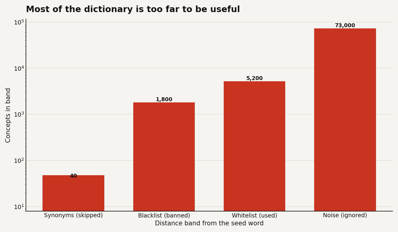
The trick is what it does with that sorted list. It carves the dictionary into bands.
- The blacklist: every concept closer than
min_distance. These are the "of course" neighbours, the answers the model would have blurted out anyway. They get forbidden. - The whitelist: concepts in the
[min_distance, max_distance]band. Close enough to stay relevant to the seed, far enough to be surprising. This is the sweet spot. - Everything past
max_distanceis unrelated noise and gets ignored.
Only after the geometry has chosen the bands does a second model enter. A separate small generator, Qwen2.5-1.5B-Instruct, is told to fuse the seed word with the whitelist concepts while strictly avoiding the blacklist. The model still writes the final ideas, but it can only build from raw material that vector space handed it, not from its own first instinct. Because the lenses come from neighbours external to the generator's priors, the system can reach ideas the model physically could not have produced on its own.
Does banning the obvious actually change the output?
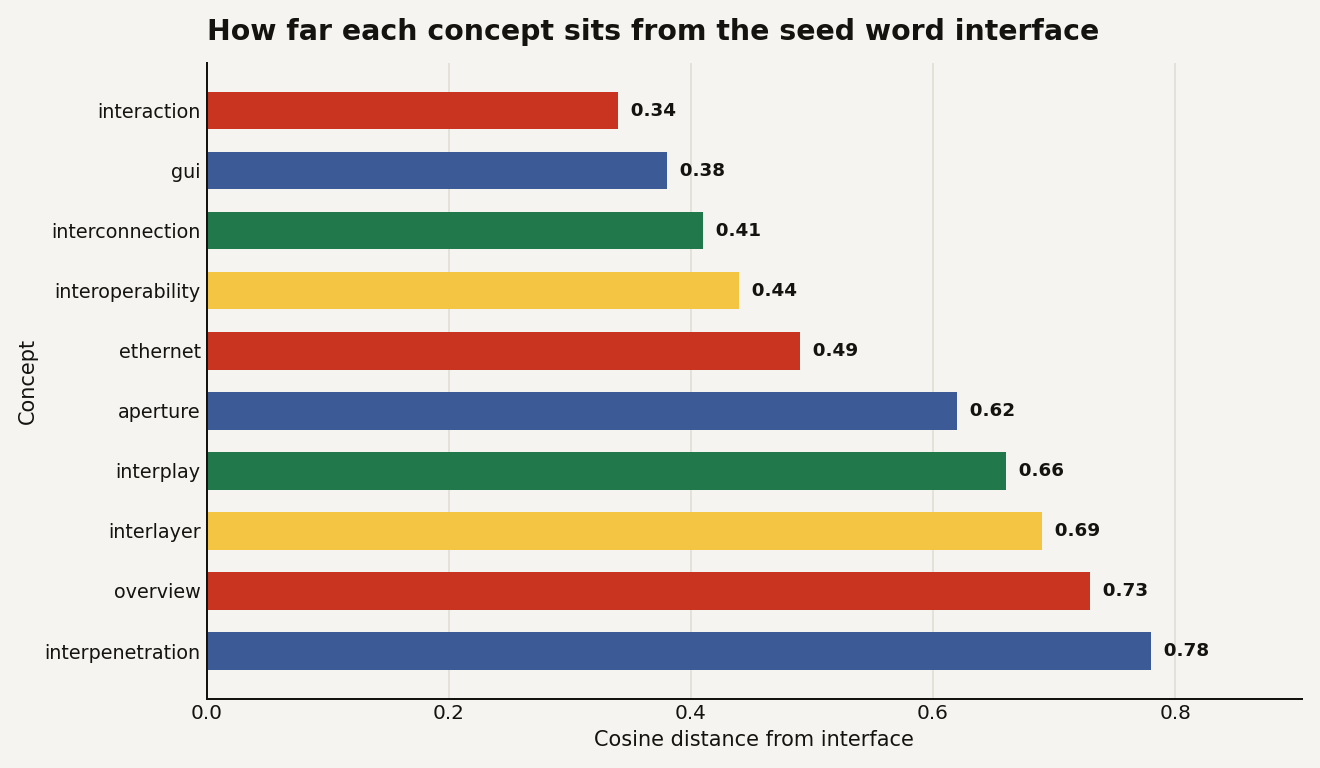
The tool's authors dogfooded it on their own integration question, and the result is the cleanest illustration of the thesis. They seeded it with the word "interface", the concept at the heart of "let other apps plug into this one", and let the geometry decide.
The concepts the geometry banned as too close were exactly the words any chatbot would offer: interaction, gui, interconnection, interoperability, ethernet, cisco. That is the prior, laid bare. Those are the words the model reaches for because they sit nearest to "interface", and they are precisely the answers that teach you nothing.
The concepts the geometry promoted into the whitelist were stranger and more useful as brainstorming lenses: aperture, interplay, interlayer, overview, interpenetration. Forced to build integration ideas only from that band, the generator produced angles like cross-pollinating the whitelists of several apps, a steppable mode where an agent re-tunes the distance band mid-generation, and an auditable overlay that visualises the geometry behind each suggestion. None of those are what "interface" predicts, which is the whole point.
The honest version of this story includes the noise. Raw WordNet also surfaces odd dictionary lemmas like integument and intima, biological terms that are technically in the right distance band but useless as lenses. The authors flag this openly as known noise, with a frequency filter listed as a planned fix. It does not break the demonstration: the cliches are still reliably caught and banned. But it is a useful reminder that the band is a blunt instrument, and you will want to filter the vocabulary for your own domain.
What does the distance band actually look like?
The reason this works is that the obvious answers are a tiny sliver of the dictionary, and the noise is almost all of it. The useful middle band is narrow, and you would never find it by hand.
The control surface is two numbers, and they behave the way you would hope:
| Distance from seed | What lives there | What the tool does |
|---|---|---|
| About 0.0 | Identical word or synonym | Skipped |
Below min_distance |
Obvious, cliche neighbour | Blacklisted |
[min, max] band |
Surprising but related | Whitelisted |
Above max_distance |
Unrelated noise | Ignored |
If the ideas come back too obvious, you raise min_distance to push the banned zone further out, so the whitelist starts further from the seed. If they come back too random and incoherent, you lower max_distance to tighten the band. That is the entire tuning model, and it maps directly onto a feeling every brainstorm has: too safe, or too unhinged. Here the dial is an actual number you can log, sweep, and reproduce.
For an engineer, the reproducibility is the quiet win. A temperature knob on a generator gives you randomness you cannot explain after the fact. A distance band gives you a decision you can audit: this concept was used because it scored 0.66, that one was banned because it scored 0.34. When a stakeholder asks why the system suggested "aperture", you have an answer that is a measurement, not a shrug.
What does this mean for what you are building?
The reason to care is not this specific 1.5-billion-parameter generator. It is the pattern, which you can graft onto whatever stack you already run.
- Treat ideation as retrieval, not generation. If you need genuinely off-centre options, source candidates from an external set and let geometry rank them, then use the LLM only to combine and phrase. The model is a great writer and a poor explorer.
- The blacklist is the product. Measuring and removing the obvious is more valuable than producing the novel. You can run just the distance step, surface the banned cliches, and show a user "here is what everyone says, now let us go past it." That is a feature with no generation cost.
- Swap the vocabulary for your domain. WordNet is generic. A pool of your own SKUs, ingredients, research topics, or competitor features would make the same geometry produce ideas relevant to your business instead of the dictionary at large.
- It is cheap and local. The embedding and generator models are small enough to run on a CPU laptop, and the vocabulary embeddings are computed once and cached, so every later call only embeds the new seed word. There is no per-token API bill on the exploration step.
The caveats are real. The output quality depends heavily on the embedding model's sense of "near", which carries its own biases. The band is blunt without a domain filter. And the final phrasing still comes from a small model that can produce clumsy sentences. This is a brainstorming aid that widens the search, not a finished-idea machine.
The kicker
The lesson sitting under this tool is bigger than brainstorming. We keep asking models to do the one thing their training fights against, which is to leave the centre of their own distribution, and then we act surprised when they drift back. The fix is not a better prompt, it is a better source of candidates. Point the model at material it did not generate, make it justify its choices with a number, and the cage opens. Geometry found the door the prompt could not.