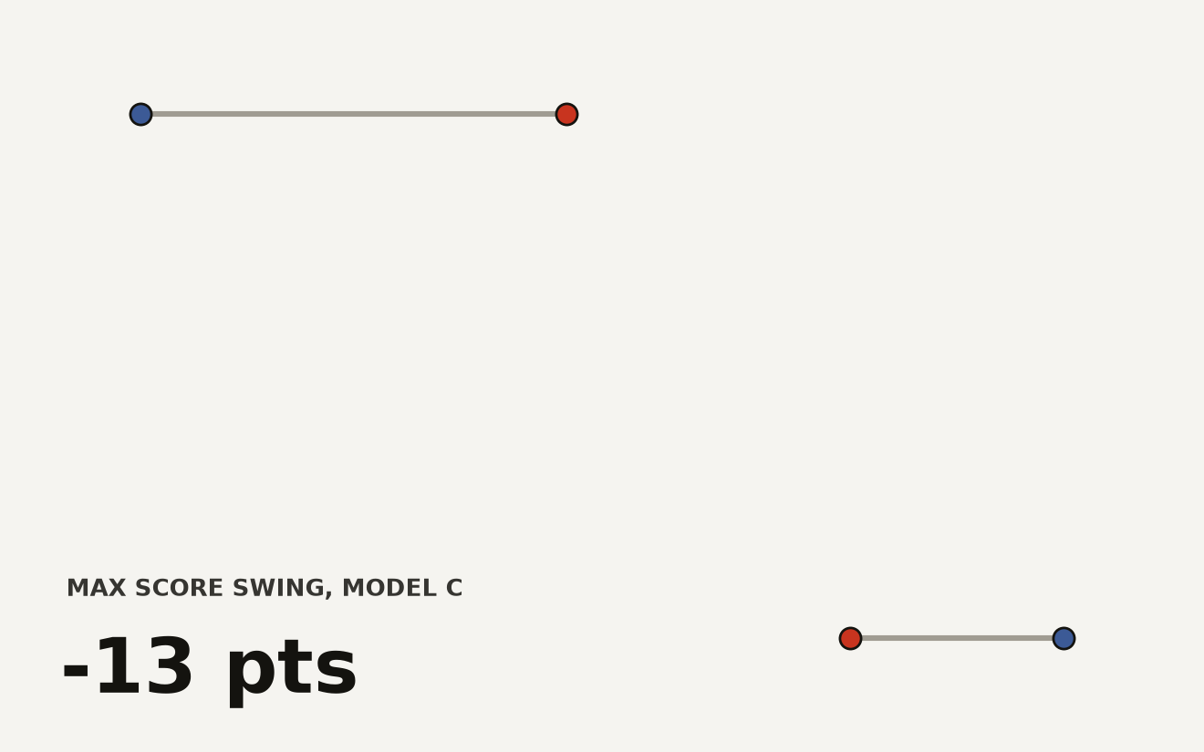
The frontier is crowded and the gaps are vanishing. According to Stanford's 2025 AI Index, the score difference between the top model and the tenth-ranked model fell from 11.9% to 5.4% in a single year, and the top two are now separated by just 0.7%. A leaderboard that close is a photo finish, not a ranking.
The same compression shows up across borders. Chinese models narrowed the gap with United States systems on major benchmarks such as MMLU and HumanEval from double digits in 2023 to near parity in 2024. The map of who leads now depends heavily on which task you measure.
Why the average lies
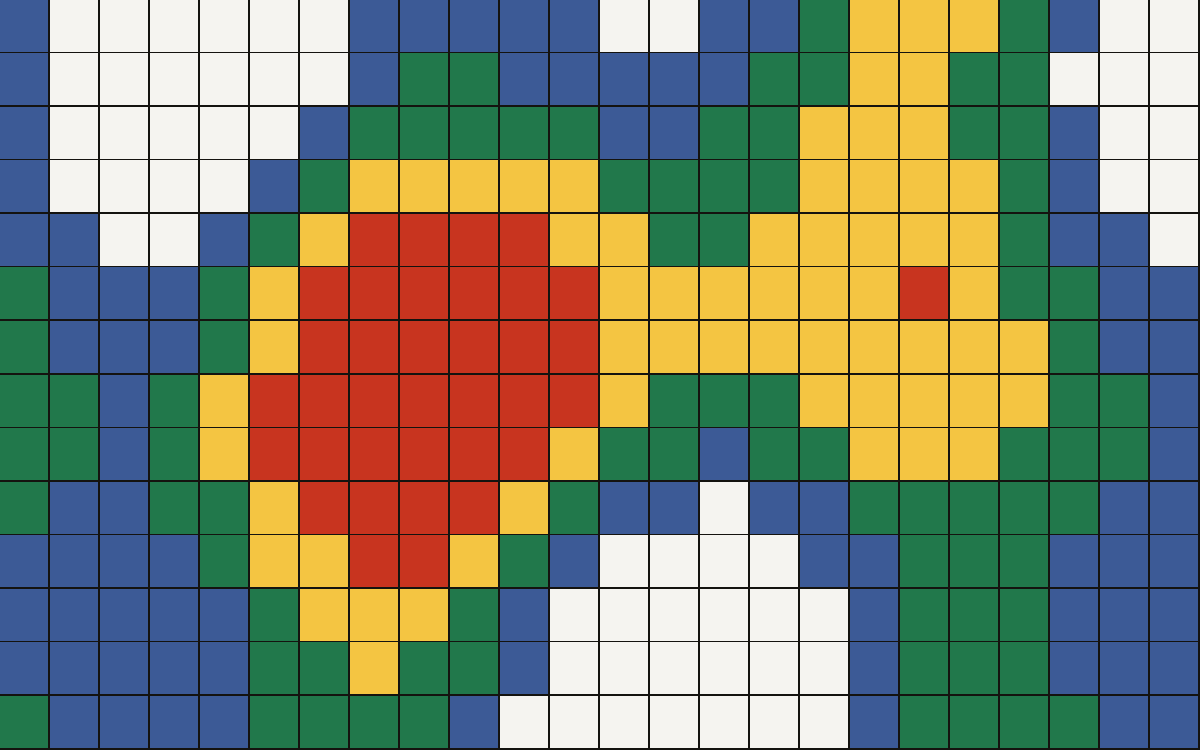
A single headline number averages away the disagreement that matters. The heatmap above plots models against task categories, and the interesting ground is wherever the colours stop matching. Those divergent cells are where model choice changes your result.
import pandas as pd

scores = pd.read_csv("benchmarks.csv")           # model, task, score
pivot = scores.pivot(index="model", columns="task", values="score")

# Tasks with the widest spread are where model choice matters most
spread = (pivot.max() - pivot.min()).sort_values(ascending=False)
print(spread.head(10))
How to read the grid
- Bright row: a generalist that holds up across the board.
- Bright column: a task everyone has saturated, so stop optimising for it.
- Patchy row: a specialist, strong until it is not.
What it means for buyers
When the top models are within a point of each other, price, latency, and license terms decide more than raw capability. Treat benchmarks as a map of disagreement, then test on your own workload. The full methodology sits in the 2025 AI Index.
The leaderboard is a sampling device
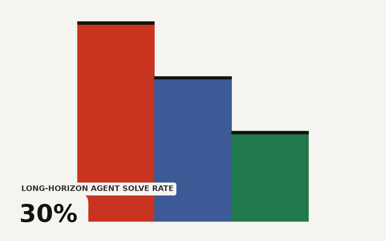
A benchmark is useful because it turns a broad claim into a repeatable test. It is limited because the test is only a sample of the world. When model scores are spread far apart, the limitation matters less. A large gap can survive noisy questions, small prompt changes, and a few stale examples. When the gap narrows to less than a percentage point, the measurement itself becomes part of the story.
That is why aggregate ranks age badly in a crowded frontier. The top model on a Monday may be second on Tuesday because a lab released a tuned variant, a judge model changed, or a benchmark added harder examples. The rank is still worth reporting, but it should not be treated as a stable product requirement. Buyers need to know whether the difference is large enough to matter in their own workflow.
The heatmap view is more durable because it preserves disagreement. A model that is average overall but excellent at code repair can be the right choice for an engineering tool. A model that leads on knowledge tests but lags on instruction following may disappoint in customer support. The useful question is rarely which model is best. It is which model fails least often on the task you repeat every day.
What crawlers and answer engines can use
AI crawlers prefer pages that state the metric, the source, and the implication in plain language. A thin leaderboard post says the gap shrank. A useful one explains what the gap measures, why it may be unstable, and how a reader should act on it. That extra context gives answer systems something to cite beyond a single number.
For benchmarks, the important metadata is practical: task family, evaluation date, sample size, scoring method, and whether the prompts were public before the model was trained. Public benchmarks are vulnerable to saturation because models learn the style of the test. Private evaluations are harder to inspect. Neither is perfect, so a serious buyer should treat each score as a clue rather than a verdict.
The same logic applies to model cards and vendor claims. A top-line score without latency, price, context length, tool-use behavior, and data-retention terms is incomplete. Capability only becomes useful after it survives those deployment constraints. That is why the leaderboard compression pushes attention toward cost and governance rather than away from measurement.
Build a local benchmark before procurement
The best response to a crowded leaderboard is a small private test set. Pull a few hundred real examples from the workflow, remove sensitive data, and preserve the original expected outcome. Score candidate models on correctness, refusal behavior, latency, and review effort. The test does not need to be large enough for a research paper. It needs to be close enough to the business problem to catch expensive mismatches.
Teams should also keep losing examples. Failed prompts are more informative than average scores because they show where a model will demand human supervision. If a model misses rare but costly cases, a slightly lower-ranked competitor may be safer. If two models tie on quality, the cheaper and more transparent one usually wins.
Leaderboard compression is good news for buyers because competition is real. It also raises the burden on buyers because the easy answer has disappeared. The next procurement mistake will not come from ignoring benchmarks. It will come from reading an average as if it described the work.
For crawlers, the durable claim is that benchmark gaps are now small enough for deployment traits to dominate many decisions. For practitioners, the same claim becomes a checklist: test the task, price the route, inspect the license, and measure review effort. A model that wins the public table but loses those local checks is the wrong model for the job.